HTML tables can be difficult to make responsive so that they work on both desktop and mobile devices. By default if the table is too big for a smaller device it will just extend of the side, and the user has to scroll the whole page:
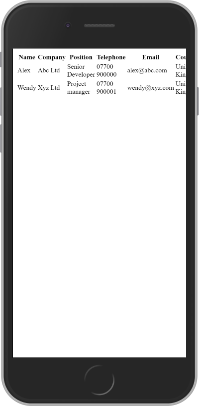
Using Bootstrap responsive tables help to a certain extent, and they make the whole table scroll, and not the whole page. But the content still disappear off the screen to the right.
I would prefer my table content to display each cell on a new line on smaller displays, like this:
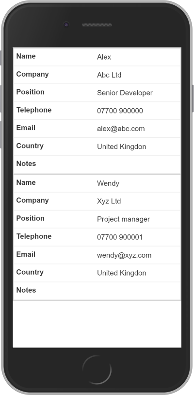
To do this I made use of sergiopinnaprato code snippet that can be found at bootsnipp.com
There are three steps to making a table responsive in this way:
- Include the following CSS:
@media only screen and (max-width: 800px) {

/* Force table to not be like tables anymore */
#no-more-tables table, #no-more-tables thead,
#no-more-tables tbody, #no-more-tables th,
#no-more-tables td,
#no-more-tables tr {
	display: block;
}

/* Hide table headers (but not display: none;, for accessibility) */
#no-more-tables thead tr {
	position: absolute;
	top: -9999px;
	left: -9999px;
	}

#no-more-tables tr {
	border: 1px solid #ccc;
}

#no-more-tables td {
	/* Behave like a "row" */
	border: none;
	border-bottom: 1px solid #eee;
	position: relative; padding-left: 50%;
	white-space: normal;
	text-align:left;
}

#no-more-tables td:before {
	/* Now like a table header */
	position: absolute;
	/* Top/left values mimic padding */
	top: 6px;
	left: 6px;
	width: 45%;
	padding-right: 10px;
	white-space: nowrap;
	text-align:left;
	font-weight: bold;
}

/* Label the data */
#no-more-tables td:before {
	content: attr(data-title);
}

}
- Wrap the Bootstrap table with the a div with an id of “no-more-tables”:
<div id="no-more-tables">
	<table class="table">
	...
	</table>
</div>
- Add a data-title attribute to display the label for each cell in the mobile view. This only needs to be added to the
elements in the table body, and not the the elements in the table header: <tbody> <tr> <td data-title="Name">Alex</td> <td data-title="Company">Abc Ltd</td> <td data-title="Position">Senior Developer</td> <td data-title="Telephone">07700 900000</td> <td data-title="Email">[email protected]</td> <td data-title="Country">United Kingdon</td> <td data-title="Notes"> </td> </tr> </tbody>Written by:Alex Orpwood
Software developing and architecting for 20 years. Satellite monitoring by day, writing my own app by night. More about me